 Call us today on
Responsive Websites - 4 Key Business Benefits
25th June 2014 :: Author: Andrew Cope, Managing Director, Evergreen
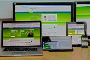
What is a responsive website? No, it's not one that talks back to you! A responsive website is one which is able to transform itself depending on the device you use and the size of the display screen. Mobiles and tablets have so many different screen sizes, that it is impossible to predict which ones will be used to access your website.
A report by eMarketer shows that mobile devices currently account for 25 per cent of all ecommerce retail in the UK and is set to grow to almost 40 per cent by 2018. According to Mobile Marketing Magazine, mobile shopping is driving UK retail sales and in 2014 sales from Tablets alone will account for 65% of all mCommerce sales in the UK. 7 out of 10 people in the UK now own a smartphone. 48% of 16-24 year olds are using apps for shopping rather than actually visiting a store. So don't ignore the power of mobile! The older generation should not be dismissed as 54% of 54-65 year olds now also own a smart phone. These figures are set to rise as confidence increases and more mobile devices come onto the market.
With so many people now using mobile devices for product both research and purchase, what are the key benefits to your business for having a responsive website?
- Google Likes it – Responsive website designs have one URL and the same HTML regardless of the mobile device that is being used. This not only makes it easier for Google to crawl, index and organise content but also makes your website easier for users to share and interact with, all of which have a positive impact on your Search Engine Optimisation (SEO)
- Positive User Experience Encourages Sales – Many mobile users will use their mobile devices to research products but feel safer actually making a purchase on their desktop PCs at home, where they can be assured of a secure internet connection. Imagine their frustration (and yours!) if they have found the ideal product during their mobile research but can't find it again when they are ready to purchase at home. You want your website to be attractive to customers at all times and give them confidence to purchase from you. Use of standardised Style Sheets (CSS) across devices and a unified design approach will create a consistent look and feel. By having a website that works well regardless of the screen size and looks the same when viewed on a mobile device as on a desktop PC, your potential customers will have a more positive user experience and be more likely to purchase from you.
- Saves You Time. With a responsive website you only have to update your content once and it will be seen across all devices.
- A Useful Mobile Sales Tool – Whether you are in a meeting room or on a train, if you have a responsive website you can show potential customers and business partners your website as part of your sales 'pitch'.
